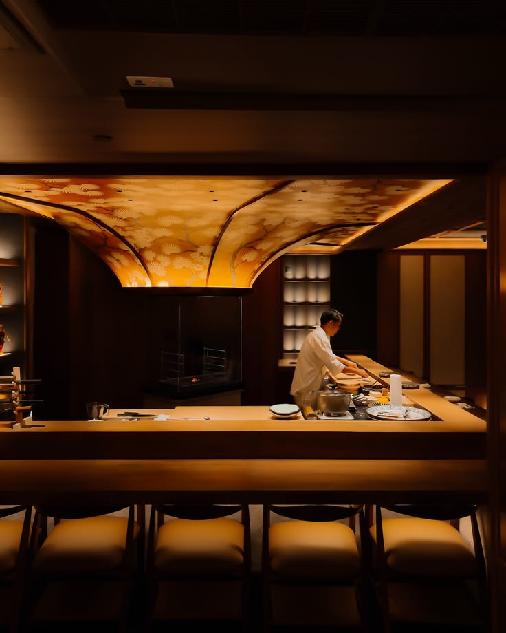
Inspired by the references you sent, this version leans further into a black, editorial layout with quieter type, more negative space, and softer text opacity. The site feels more premium, more atmospheric, and closer to a luxury Asian restaurant rather than a generic template.


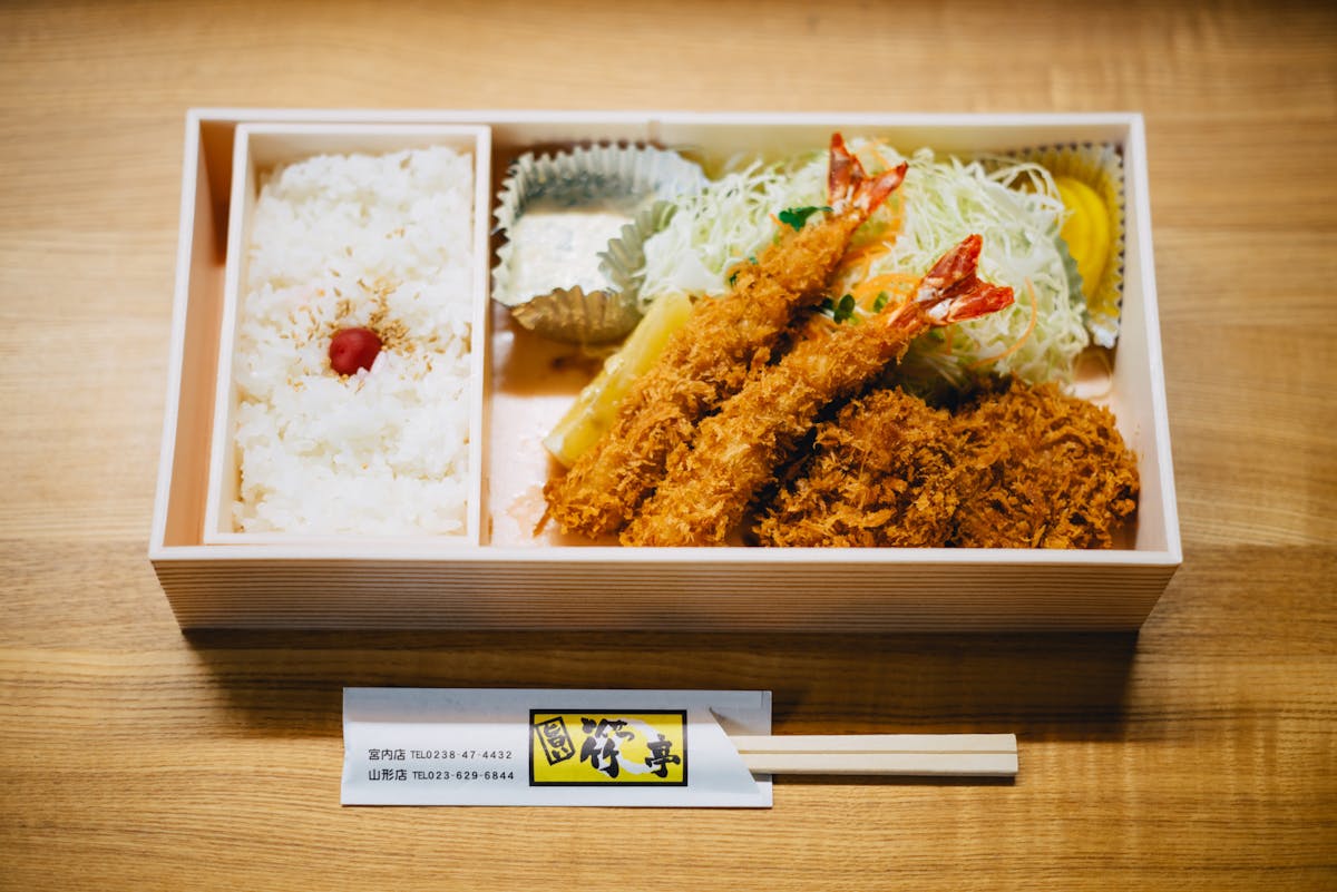
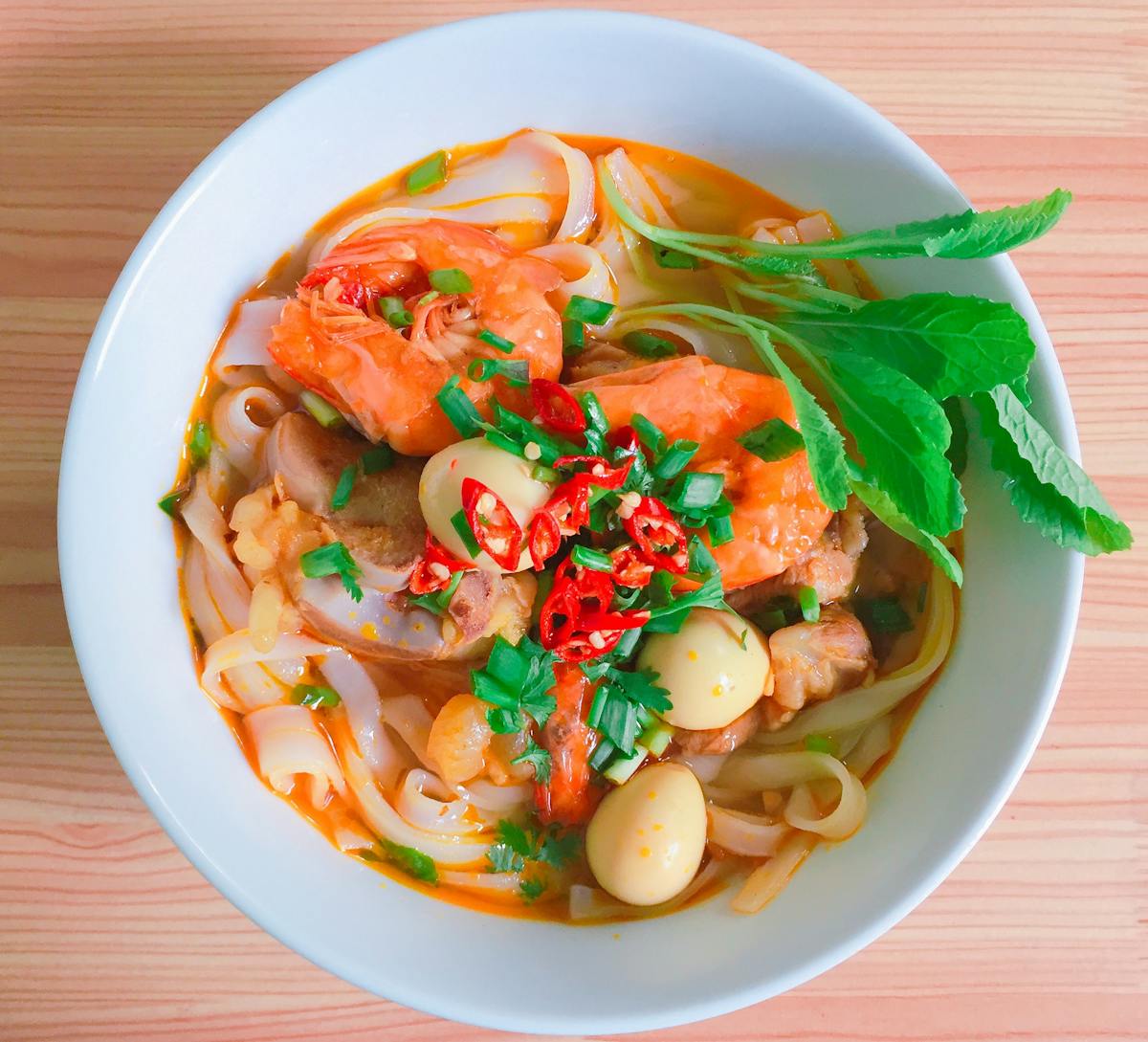
The composition here is intentionally more graphic and editorial: black background, softened serif type, carefully cropped food photography, and modular image blocks that echo the second reference image you attached. It should feel elevated, sparse, and image-led.


Focused menus, intimate counter dining, and premium seasonal sourcing come together in a dining direction that feels both Asian and luxurious — quiet rather than flashy, and rich in mood instead of crowding the screen.

Quiet seating designed around the chef, the fire, and a more personal dining ritual.
Rare cuts, seasonal seafood, and focused plates delivered with restraint and care.
A booking-led flow intended for premium dinners, intimate occasions, and gifting.